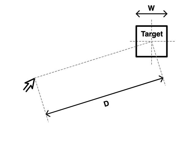
Fitts qonuni, maqsadli hududga o'tish uchun zarur bo'lgan vaqtni nishongacha bo'lgan masofani nishonning kengligiga bo'lish funktsiyasi ekanligini taxmin qiladi.

Ushbu qonunning oqibatlari shuni ko'rsatadiki, UX yoki UI-ni loyihalashda interaktiv elementlar imkon qadar katta bo'lishi kerak va foydalanuvchilarning diqqat markazida va interaktiv element o'rtasidagi masofa imkon qadar kichik bo'lishi kerak. Bu, odatda, bir-biriga yaqin ishlatiladigan vazifalarni guruhlash kabi dizaynga ta'sir qiladi.
Shuningdek, u "sehrli burchaklar" tushunchasini rasmiylashtiradi, foydalanuvchi sichqonchani osongina bosishi mumkin bo'lgan ekran burchaklari - bu erda asosiy UI elementlari joylashtirilishi mumkin. Windows Start tugmasi sehrli burchakda joylashgan bo'lib, uni tanlashni osonlashtiradi va qiziqarli kontrast sifatida MacOS 'oynasini yopish' tugmasi sehrli burchakda emas, bu esa xato bilan urishni qiyinlashtiradi.
Shuningdek qarang:
Fitts' law predicts that the time required to move to a target area is a function of the distance to the target divided by the width of the target.

The consequences of this law dictate that when designing UX or UI, interactive elements should be as large as possible and the distance between the users attention area and interactive element should be as small as possible. This has consequences on design, such as grouping tasks that are commonly used with one another close.
It also formalises the concept of 'magic corners', the corners of the screen to which a user can 'sweep' their mouse to easily hit - which is where key UI elements can be placed. The Windows Start button is in a magic corner, making it easy to select, and as an interesting contrast, the MacOS 'close window' button is not in a magic corner, making it hard to hit by mistake.
See also: